Discuss here, or make suggestions, for the prospective upgrade to the wiki's look. - Meco (talk) 08:56, 22 June 2009 (UTC)
maybe we could make it so that it looks like a green tiberium crystal. dark, shiny green or somehow have a diffrent 'theme' colour/skin for each side. (Soviets get a red theme colour with some steel or something, Empire has a sunburst, Nod is red as well but darker, Scrin are dark and purpleish) not sure if that makes sense but that's my idea.--Yellow 13 16:17, 21 June 2009 (UTC)
I agree with Yellow 13. Pages about the soviet union should have a red theme and perhaps a communist background, while pages about the GLA should have a red theme with a GLA background (I'm sure there is one somewhere). Like, all pages concerning soviet units will have that background and the red theme. It is going to be quite long to do but I can assure you it's going to look great. CKeen
Whatever ends up having, remember that usability is the #1 priority. Anything that makes the text difficult to read, whether that be the content or text links, are an absolute no-no. Backgrounds are a quick way to fubar usability. - Meco (talk) 08:51, 22 June 2009 (UTC)
BTW I will be changing the C&C Wiki's logo by removing the Tiberium. (C&C isn't only just about the Tiberian universe...)--Victor-195 19:28, 22 June 2009 (UTC) Thanks for your comments!
Main thing I'm concerned about is the accessibility. I agree with Meco that anything must not makes the wiki difficult to read. Some colour would be nice but it should not be excessive. --Tkangaru 07:36, 23 June 2009 (UTC)
Yeah I agree that anything that makes the text difficult to read is an absolute no-no, but take for example the Starcraft wiki, it has a background that doesn't make the text difficult to read. I meant something like that for the background. CKeen
Very, very true. FF Wiki changed their skin a while back...for nearly a month they had the normal medium-blue text for the options buttons and so on in the top corner; but they had the same background they have now, which was approximately the same color in that area...so while the different color ideas (Yellow 17 is on to something there) are fine with me, keep the important things clearly visible. The.DreadnoughT 01:25, 24 June 2009 (UTC)
I completely understand that text visibility is a major concern. :D Also, I have a few announcements on the progress:
- I will (if possible) create many different skins (meaning I will create one at least for every faction in the C&C series)
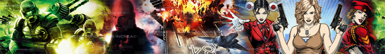
- For the default skin,however, I will create one combining all the factions in the C&C series. (Kinda like [1]. Notice a dark background yet the text is easy to spot.)
- To see a preview of the banner on the default skin click below.
--Victor-195 01:35, 24 June 2009 (UTC)
- The banner is too crowded and looks bad because of it. Backgrounds are out of the question, add small banners to templates and infoboxes but don't do any sort of background. Everything under the text must be plain colour.
- In my opinion, it'd be best to stick with the current, blue scheme, but add graphical elements that make it look more like the EVA database. http://images2.wiki.nocookie.net/fallout/images/thumb/5/5c/Scribe.jpg/15px-Scribe.jpg Tagaziel (call!) 15:10, 24 June 2009 (UTC)
- Well, how do should I "space out" the images? There is a size limit and I had to find a way to include all of the games. (Renegade wasn't included because it was part of the Tiberium universe)--Victor-195 21:58, 24 June 2009 (UTC)
- And if you dislike the final skin you can still go back and use this current skin (Sapphire). :\
- As I said, it's a moot point - I've asked our resident expert over at the Vault to help us with a new look and he will be happy to do so. Porter Engineering is where it's at. http://images2.wiki.nocookie.net/fallout/images/thumb/5/5c/Scribe.jpg/15px-Scribe.jpg Tagaziel (call!) 22:56, 24 June 2009 (UTC)
I like the idea of giving the pages more character via background colour or/and text colour changes. I also like the above banner, it's great that you managed to incorporate all 3 universes of C&C into one banner. Dd7900 21:14, 24 June 2009 (UTC)
This discussion is moot, as a graphical overhaul will be provided courtesy of Porter Engineering. http://images2.wiki.nocookie.net/fallout/images/thumb/5/5c/Scribe.jpg/15px-Scribe.jpg Tagaziel (call!) 21:45, 24 June 2009 (UTC)
- If there are two designs in the works than that gives the community more choices. Carry on, Victor-195. - Meco (talk) 00:08, 25 June 2009 (UTC)
Banner design updated!--Victor-195 01:41, 25 June 2009 (UTC)
Can anybody tell what the new File:Favicon.ico is supposed to represent? Whatever it is I think 16x16 is too small for a suitable rendition. - Meco (talk) 05:58, 30 June 2009 (UTC)
- It's the original C&C cymbol from Tiberian Dawn. http://images2.wiki.nocookie.net/fallout/images/thumb/5/5c/Scribe.jpg/15px-Scribe.jpg Tagaziel (call!) 09:02, 30 June 2009 (UTC)
I think it should be replaced. At such a low resolution it doesn't look like anything. Not to mention it doesn't go with the new skin which is very blue. - Meco (talk) 19:28, 3 July 2009 (UTC)
Hey there, I'm the one who created the current skin (no stone-throwing please, tomatoes only). Just wanted to mention that the front page was/is just a showcase since I didn't want to go about rearranging the content too much; I'm not a regular here after all and didn't feel it'd be right for me to do that.
As such, I don't think it's optimal - for one, there's too much stuff in the right column (the one with the poll) and too few content in the main one which results in a lot of whitespace, especially since some of wiki's ads are displayed in that column as well. In my opinion, it'd also be better if the "universe button" images were grey-scaled so they don't disturb the color scheme as much. The logo should probably also be more horizontal and the "universe buttons" below it.
Just a few suggestions. However, all of these are not really part of the skin so feel free to fix them up as you please :) -- Porter21 (talk) 18:48, 30 June 2009 (UTC)